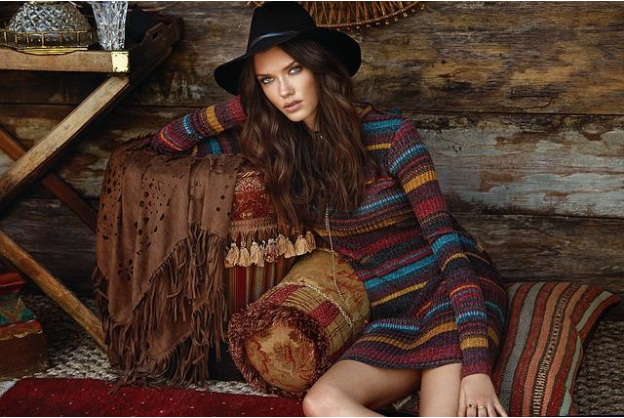
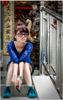
From strikingly retro rompers to boho breezy silk kaftan dresses, this season is all about vibrant, unexpected prints and the boldest, most playful colors you know and love. As with most things in life, the name of the game is high risk, high reward: making adventurous choices in refreshing your wardrobe can have a major payoff when it comes to pairing prints with your personal color profile. Whatever your unique color palette, Summer 2017 styles offer a little something for everyone.

Know Thyself
It’s a good philosophy for life, and it’s a good philosophy for fashion. Tracking down your correct color palette can be a remarkably useful (and surprisingly fun) way to put yourself on the right track for selecting colors and prints. For a friendly and fairly concise guide to determining your seasonal color palette, consider checking out this handy quiz. For those who already have a command of their color palette, here are some suggestions by season.
Cool Summer
Not just something you might write in a yearbook, “cool summer” denotes a soft and cool palette that plays beautifully with airy florals and elegant throwback paisleys. Complement your tones with cool grays, aqua, and rose gold.

Soft Summer
Classic and natural, the soft summer profile thrives on prints inspired by the natural world. Deep blue, blush pink, and silver are natural go-tos.
Light Summer
For a radiant seasonal look, light summers fare well in lush floral prints, often in chic pastels, lemon yellows, and splashes of teal.
Warm Autumn
Most frequently redheads, warm autumns tend to look absolutely stunning in vivid jewel tones. When it comes to the perfect print pairing, I recommend retro-inspired geometric designs, which are trending heavily this season.
Soft Autumn
Much like soft summer, the soft autumn color palette plays well with classic and natural tones. Find your inspiration in boho chic patterns and prints that weave in elements of cream, navy, and bronze.
Deep Autumn
Characterized by luxe, rich colors like deep burgundy, olive, and caramel, deep autumns can achieve a stunning visual impact in large format floral prints and high drama mixed patterns.
Warm Spring
The warm spring palette is a perfect fit for summer fashions, with soft, luxurious warmth and a rosy glow. Play to your strengths with feminine, garden party-ready prints, or make a bold statement by combining avant garde patterns with lavish pinks and oranges.
Clear Spring
The clear spring palette is bright, beautiful, and ready for anything. Opt for adventurously bold, striking patterns like thick stripes or on-trend zig-zags in ocean blue, bright yellow, and tangerine.
Light Spring
Effortlessly sophisticated and classically romantic, the light spring profile thrives on soft peach, robin’s egg blue, and cream. For a chic take on classic prints, opt for vintage inspired prints with an Art Nouveau feel.
Cool Winter
The cool winter palette favors dramatic colors and prints alike. Experiment with large-format color block patterns, and don’t be shy about mid-century modern prints.
Clear Winter
Refreshingly vivid colors are the wheelhouse of the clear winter palette. Sink into pure red, violet, and emerald, and offset these bold hues with detail-oriented, subtle prints.
Deep Winter
Perhaps ironically, the deep winter profile looks simply gorgeous in summer. Luxurious blues, pinks, and greys – especially set against clean white – might just revolutionize your look this season.
This season offers the best time of year to experiment with bolder looks and statement pieces. So, no matter what your true color palette may be, be sure to mix, match, and step outside your comfort zone to find a new look that makes a splash this summer!